Check-in as a service, not just a screen
Thinking at Scale
Strategic UX Research
šŸ“š 5-8 min read
Digital patient check-ins are kind of a big deal.
I worked on Epic’s Patient Arrivals team, where a big focus of our product strategy that year was improving digital patient check-ins. When you go to the doctor’s office or a clinic, you have to check in before you’re seen.

Post-pandemic, organizations are focused on having staff operate at the top of their license. Our customers goal is for front desk staff to work at the top of their licensure. This means spending less time on checking in patients as they walk through the front door and more time doing other things.
So we’ve crunched the numbers before with our customers, and discovered that for every digital check-in a patient completes instead of going to front desks, organizations save about $3.
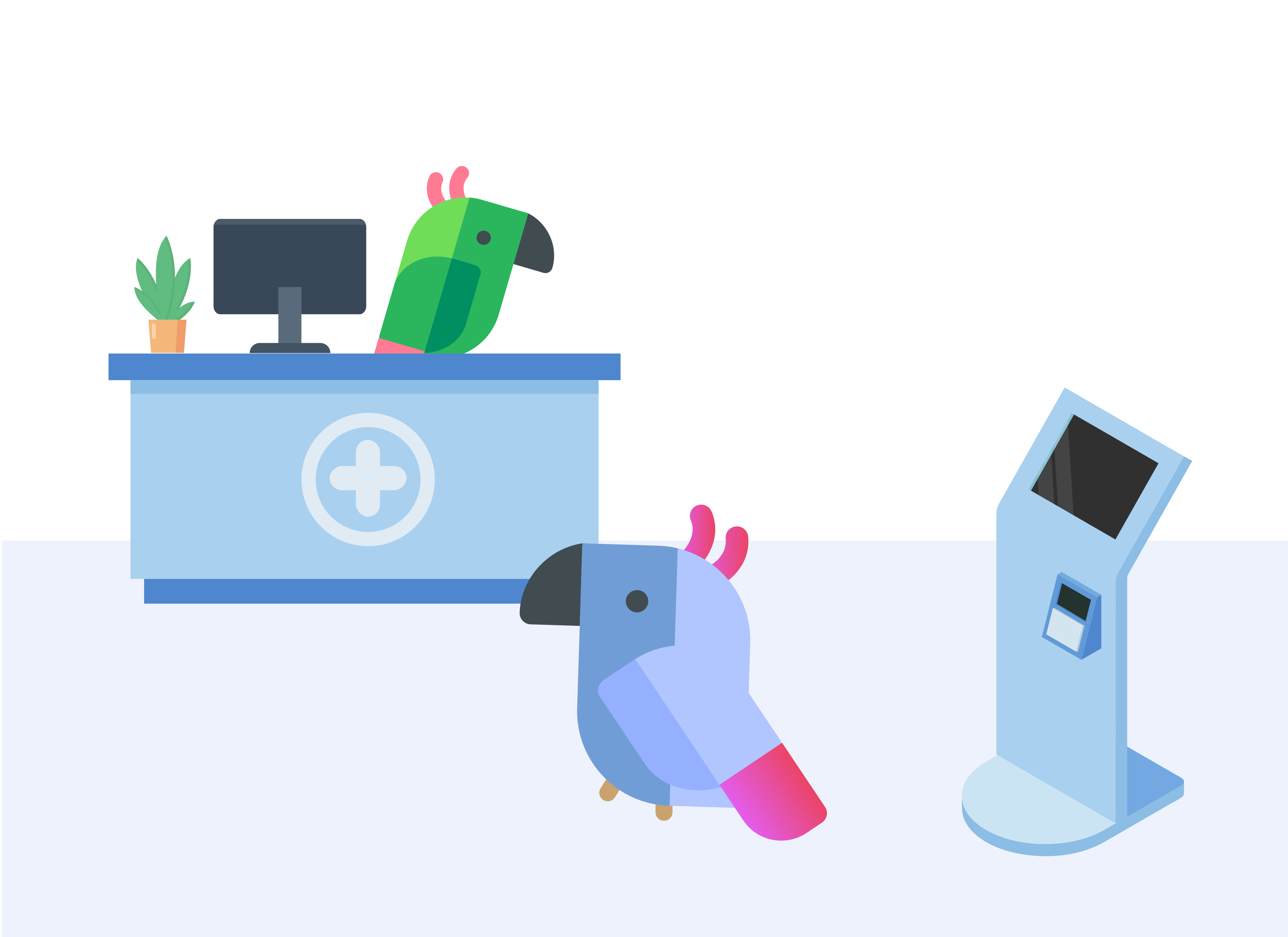
Registrar whose other
tasks are interrupted
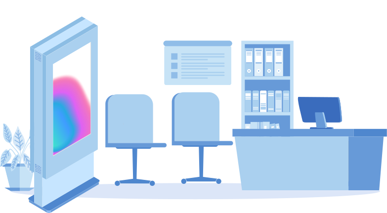
Underutilized digital kiosk
Patient checking in
Underutilized check-in kiosk
Patient checking in
Registrar whose other tasks are interrupted
Problem statement
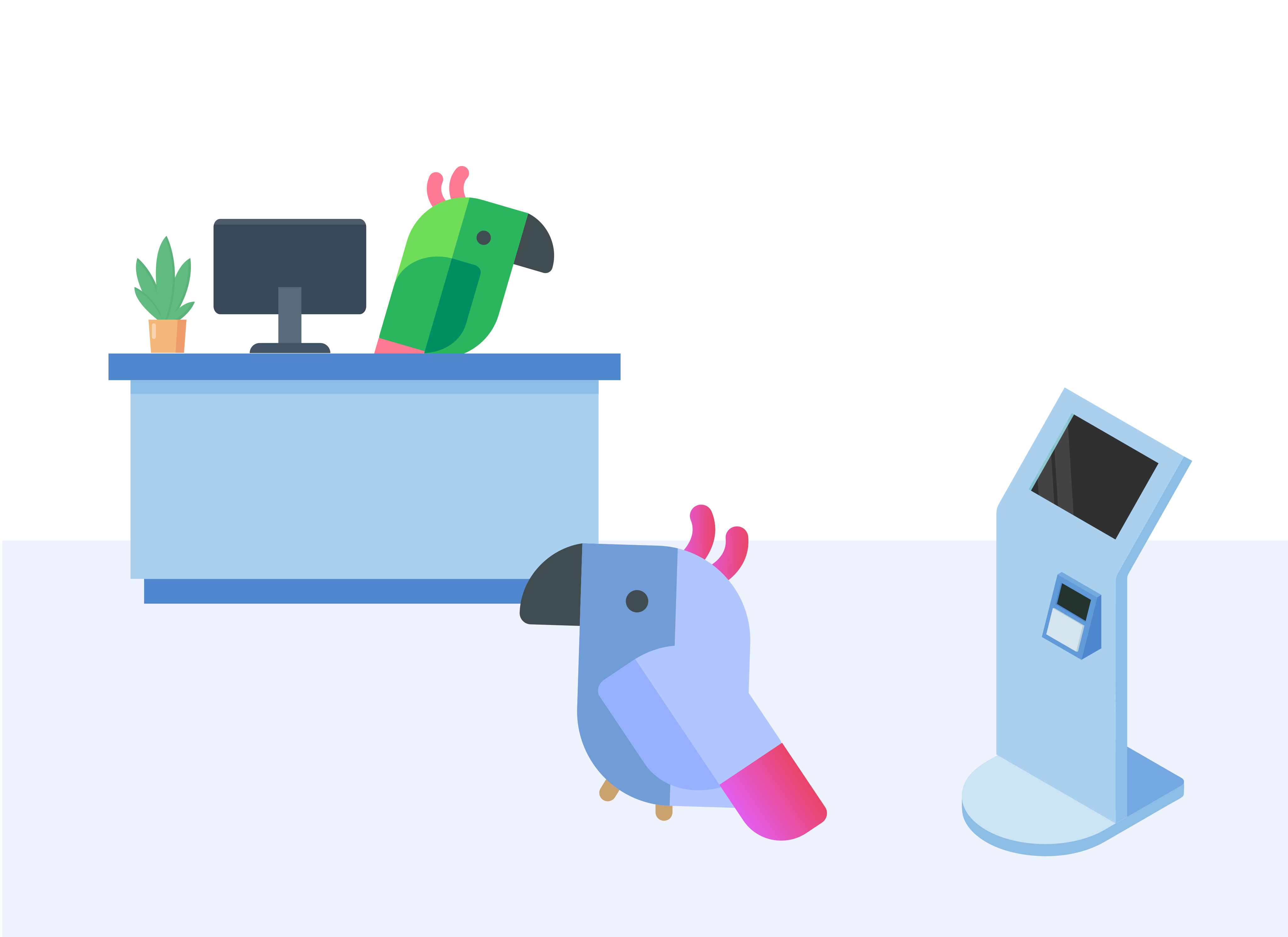
Digital check-in kiosks are underutilized by patients, resulting in decreased front desk staff efficiency and increased organizational overhead.
Two platforms, one goal
The patient check-in process can happen on 3 different products - the MyChart app, online web service, or the physical check-in kiosks in clinics.
šŸ’” Any changes we made needed to account for all these different modalities of the digital check-in experience. My goal was to build a single design system for patient registration with a few exception carve-outs.
The check-in workflow is customizable by each organization, which adds a layer of abstraction and complexity. We designed an out-of-the-box solution, offering a standard workflow that organizations can modify.
The Outcomes
Projected 4.5m Ā annual savings across 3 pilot customers
We piloted our new implementation checklist at multiple clinics across three customer organizations. This increased front desk registrars’ efficiency is project to save over $4m in the first year.
A shift in staffing models across organizations
ā€œWhen patients started checking in on kiosks, we were able to reduce hiring for future positions. We estimate we’ve saved more than $15 million.ā€ Read more
11%↓ Ā Dropoff
In the 3 months following our questionnaires UI updates, data reports across the new released version show an 11% decrease in user drop-off at the questionnaires step of check-in.
Implementation guide used in over 25 new installs
Following the success of our pilot customer adhering to kiosk guidance checklist, it is now adopted company-wide and requirement for our implementation team at every kiosk installation.
15%↑ Kiosk Usage
After 6 months we reported a 15% increase in kiosk usage across the 3 organizations that relocated kiosks to adhere to our placement checklist.
Uncovering problems &Ā talking to users
I traveled onsite for a wees to one of our primary healthcare organization stakeholders who offered to host us for a week. I met with our customers' executive team and clinical subject matter experts to understand their long term goals for the front desk check-in experience. IĀ also conducted patient interviews and got the chance to shadow their front desk staff across different clinics.

I also got the chance to meet with a few patient interviewees and conducted usability testing of our baseline workflow.
šŸ’” Due to seeing a lot of quantitative data early on, stakeholders had become fixated with this idea of an ā€œaverage userā€ - someone who wanted to quickly go through the motions of check-in. I used patient stories from my research to convince them otherwise.
Take one patientĀ I met for example, we’ll call her Maxine, was highly concerned with data privacy. Although our UI presented this step as a set of optional dropdowns, she was still frustrated. Through the lens of Maxine, IĀ had uncovered two more granular problems:
  1. Our system logic wasn’t matching the real world. I learned from our on-site executive meeting that healthcare organizations are incentivized to collect and report demographic information. The purpose of this is to analyze social determinants of health and improve patient outcomes. Ā HOWEVER, when a patient like Maxine chose to leave the drop downs blank, the system recognized this as incomplete. Maxine’s frustration stemmed from being included in frequent email campaigns to ā€œcompleteā€ her profile. So one of the things I brought back to our team was that we needed a way for the system to DISTINGUISH between patients like Maxine. And thus was born an emphasis on a ā€œDecline to self identifyā€ dropdown that organizations could collect and report on.
  2. The human element. Although front desk staff are trained to ask the same demographic questions, they don’t always. Perhaps Maxine was asked once and told the registrar she didn’t want to share. They could create a note, or even recognize her and remember her preference. This creates a patient perception that checking in at the front desk is not only more efficient, but a more personalized user experience.
Generating buy-in
Right before our next big design meeting, I made "proto-personas"Ā andĀ rushed to the meeting room early to tape them up on the wall. When everyone got there, they immediately became a point of interest and made people curious and excited about the meeting. Want to hear more nuanced thoughts on personas?Ā Read more here
šŸ’” Many individual stakeholders became passionate about a particular persona, and become a champion for that user. Design conversations shifted away from ā€œWhat would our user (no plural) think of this?ā€ to ā€œHow would Maxine feel about this feature?ā€Ā Ā 
The user personas were impactful beyond the project and lingered with our team. The personas became KPIs, and set the stage for a problems-solutions matrix I presented to leadership and our engineering teams.
Here are a few abstracted UI solutions I designed
Broke up long forms into multi-step linear workflow to decrease cognitive load. Users preferred this format in testing.
Removed scrolling from questionnaires forms after field observations of older kiosk devices struggling to register swiping motions. Learned that kiosk device lifespan ā‰ˆ 7 years

Problem #1: Long sections that exceeded the screen height were difficult to scroll, causing frustration and even drop off.

Role: UXĀ researcher and designer

How IĀ solved it:Ā IĀ came up with a few iterations for broken up layouts and shared them out in our design incubator to get feedback. We ABĀ tested this change during our cafeteria testing with a live kiosk and noticed a significant improvement in efficiency.

  • I removed scrolling from questionnaires forms after field observations of older kiosk devices struggling to register swiping motions. Learned that kiosk device lifespan ā‰ˆ 7 years
  • Broke up long forms into multi-step linear workflow to decrease cognitive load. Users preferred this format in testing.
A simplified ā€œMoreā€ area means users can add more info, while others can move on uninterrupted.
Since tap targets on kiosks have less accuracy, I Ā separated the workflow into smaller chunks to increase speed.

Problem #2: The personal information page was visually cluttered and had a lot of tap targets that were difficult for kiosk users to press. Overall there were a lot of small heuristic paper cuts on this section of the check-in workflow

Role: UX &Ā visual designer

How IĀ solved it: IĀ leaned on the gestalt principles to better connect the many concepts on the page and created a vertical paradigm to reduce cognitive load. We also referred to our different personas' goals and frustrations as a team to test this layout from multiple perspectives. The new page has a "dive deeper"Ā approach for the users who want to do more granular data entry while not overwhelming the ones who don't.

  • Since tap targets on kiosks have less accuracy, I Ā separated the workflow into smaller chunks to increase speed.
  • Created a simplified ā€œMoreā€ area means users can add more info, while others can move on uninterrupted.
New area for orgs to add Ā contextual information Ā - what is this data point, and why is it collected?
Created a new component for our design system for multi-select dropdown fields

Problem #3: Previously kiosks were using a multi-select drop down component from MyChart's web check-in that required users to press CNTRL to select more than one input. Not only did this not work at all for tap kiosks, it was also not an accessible paradigm for mouse-only users on the web.

Role: UX designer, A11y

How IĀ solved it: The original design had a lot of usability and accessibility issues even on its original MyChart web platform. I talked to our design system developers to understand the component's design debt and get buy-in to Ā build a new cross-platform component. I investigated existing patterns across the web to create a more familiar experience for users and worked with the dev team to understand limitations between our tech stacks. I convinced our team the worth of doing the extra development needed to add it to our Ā Standard Development Kit. That means that every workflow across both products using the component would get the new update automatically.

  • I created a new component for our design system for multi-select dropdown fields.
  • Added a new area for orgs to add Ā contextual information Ā - what is this data point, and why is it collected?
Users who select this will not receive ā€œmissing informationā€ emails and organizations can meet reporting goals.
Created a way for patients to opt out that’s different from no response.
Problem #4: Our system did not match the real world or our customers' needs. From our customer needs conversations, we found that organizations are financially incentivized to gather and report demographic data points about their patient population. When a patient declines to answer, that's actually a discrete data point that orgs can report.
Role: Business analyst, user advocate
How IĀ solved it: I added "Decline to answer" as a selectable option and moved it to the top of the drop down list. I worked with our analysts to create update system logic in our email campaign system to exclude patients who select this discrete option from emails reminding patients that they are missing information. This is also a huge win for our users who are passionate about their data privacy.
ā€
Getting the team to think about our work as service design
To set the stage for this problem, we have over 300 customer organizations using our digital check-in solution, and each one adopts differently. Most orgs let patients choose whether to use the kiosk.
1. Total adopters, such as NYU, require that patients use digital check-in. Even for organizations that use with this model, adoption is not 100%. After all, if a patient can’t complete the workflow, they can’t be seen. So front desk staff still exist to help patients who are stuck and can check them in manually as a last resort.
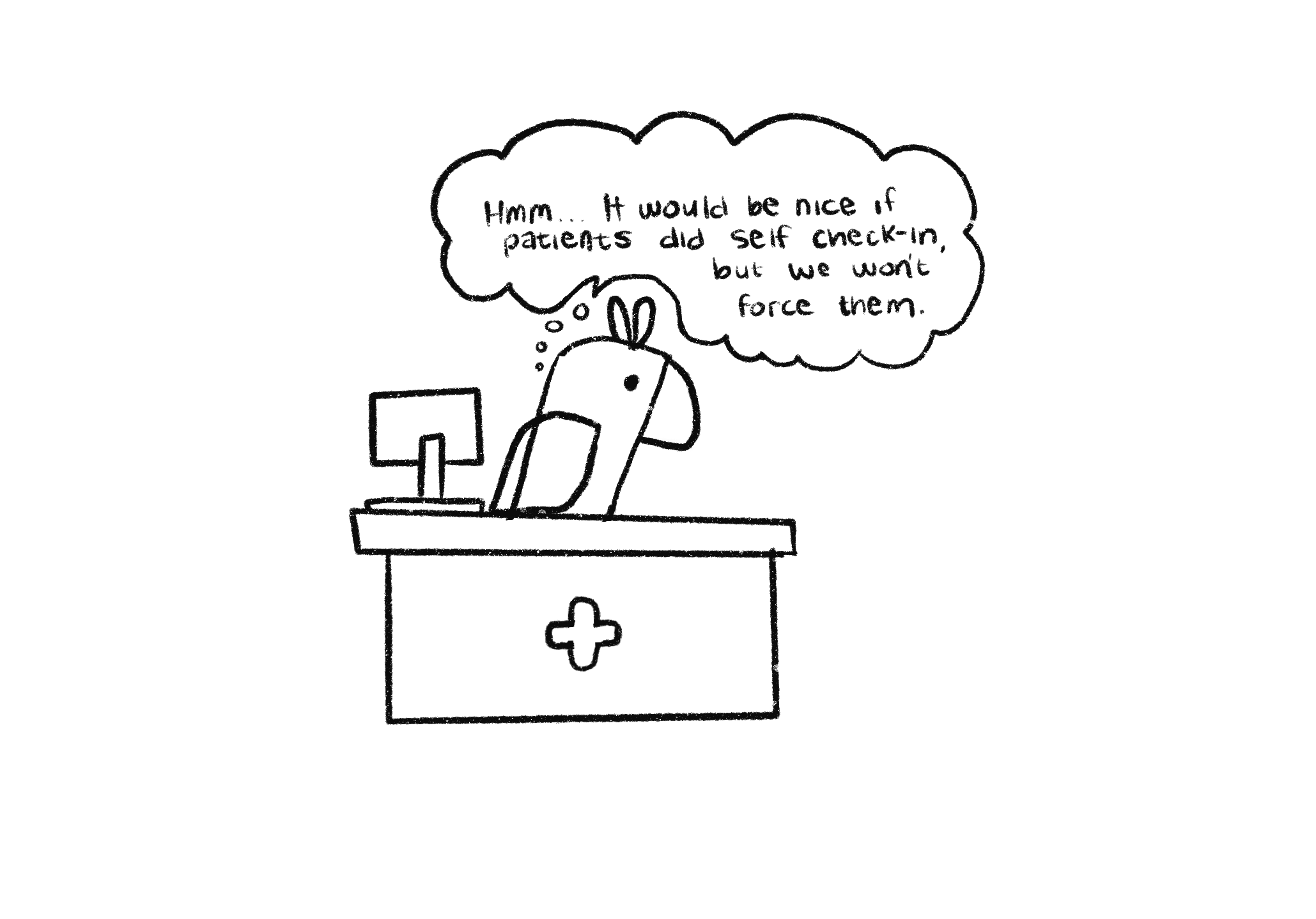
2.Organizations who let patients choose what works for them - using the kiosk, going to the front desk, or doing it on their phone. This yields patient satisfaction, especially for those who are less comfortable with technology. Most organizations follow this model.
When I shadowed front desk staff at a dozen clinics, I got a chance to talk to registrars firsthand and observe patients.
šŸ’” "Nothing never happens...ā€ I made an effort to jot down any observations, even if they seemed insignificant or obvious at the time.I sketched the physical layout of the clinics, flows of patients, and how often each kiosk was being used.
I did this at each of the dozen clinics I visited, and sure enough a pattern emerged. Psychology played a big part of this, and for most patients whether or not to use the kiosk was a highly variable decision depending on where it was placed or how busy the clinic was. Here are some of the sketches I made.
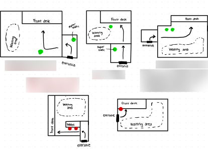
One of the registrars I talked to shared that the clinic moved to a new building last month. It was still in the same strip mall lot, and they had the same patient base. And yet, kiosk usage went up around 15% by her estimation. I asked her what changed. Not a lot except for the physical layout of the lobby and reception area.

During our trip wrap up, I met with executives and shared all of my findings and talked through some of the ideas I was bringing back to the team. The director of patient experience came up to me afterward and wanted to talk more about the placements. Until now, he said, the only factor for where a kiosk was placed was the proximity to an electrical outlet.Ā So where did we go from there?
Coming up with a systems-level solution beyond UI
While IĀ was working on the UIĀ solutions, IĀ started sharing these findings and found an influential person in R&D leadership who has been passionate about this cause.
šŸ’” We built a coalition of implementation and R&D stakeholders to draft a document of placement guidelines from my research.
I met with subject matter experts and created an implementation checklist that is now used at every customer installation.
Problem #5: The biggest take away from our field observations was that the physical placement of the kiosks was a key indicator of adoption success. From talking to our organizational stakeholders, we learned that proximity to an outlet was the only decision point for how they placed kiosks.
My role:
Business analyst
How I solved it:
Previously, we provided little to no guidance to orgs or our install teams on optimal placement. I worked with our division's customer success owner to crowdsource a set of kiosk placement guidelines from my research. We presented to our pilot customer and came up with some low cost strategies to move around kiosks in their most impacted locations. Following up after adoption, kiosk usage in those locations increased between 15-25%.

Problem #5: The biggest take away from our field observations was that the physical placement of the kiosks was a key indicator of adoption success. From talking to our organizational stakeholders, we learned that proximity to an outlet was the only decision point for how they placed kiosks.ā€

ā€My role: Business analyst

How I solved it: Previously, we provided little to no guidance to orgs or our install teams on optimal placement. I worked with our division's customer success owner to crowdsource a set of kiosk placement guidelines from my research. We presented to our pilot customer and came up with some low cost strategies to move around kiosks in their most impacted locations. Following up after adoption, kiosk usage in those locations increased between 15-25%.

Together, we created a customer-ready draft of Kiosk placement guidelines, the first of its kind. From here on out, this document is shared to every customer and a checklist at every new Epic installation. This was presented on at our company’s All-Staff meeting as a huge success in process and a case study on things to look out for beyond the software on customer trips.
Thank you for reading!
Back to home