User Personas and Vanity Deliverables
UX Research
📚 5-7 min read
I want to give some creds first... in late 2022, my colleague Mark LeBay approached me on giving a joint talk on user journeys for Epic's World Usability Day conference. This ended up sparking a massive interest in a topic that is pretty much a dead horse at this point. But alas, I am here to proverbially beat the dead horse because I have a growingly nuanced take.
Personas are unshockingly controversial
There are countless youtube videos, medium articles, and linkedin posts that will go into the details of why. My summary is that they tend to be a vanity deliverable. It's not 2021 anymore... at many lower maturity companies, design roles are fighting tooth and nail to demonstrate value.

For companies that don't have dedicated UX Researchers or well planned research budgets, designers can be left in the dark. Sometimes, designers are left with a directive to build a product based on vibes. Maybe they don't easy get access to users, or understand them well. Creating some user personas can be a flashy and low effort way to appear like you're doing something,

So here's my point: most teams that are mature enough to understand their users don't make user personas. They move onto bigger and better things... maybe they have a research repo or another more structured journey map to organize user insights.  The teams that are left tend to make personas in an attempt to grasp onto something... anything... to justify design decisions.
Let's get into exactly what makes a bad persona
UX personas evolved from marketing personas, but they couldn't be more different. And with that evolution left a lot of... vestigial... characteristics.
Unless I'm designing for HBO Max, I don't care if my user is team Stark or team Targaryen.
Because they tend to be a vanity deliverable, user personas are often bloated with irrelevant info, biased bullet points with no source, and weird UI elements. It doesn't help that if you google "Persona template" many look like the one above.

On the topic of weird UI elements, another common feature of templates is a tendency to turn information into sliders, toggles, or a quantitative scale. All this does increase cognitive load and creates context loss where the audience fills in the blanks with their own biases.
Many persona templates have these types of sliders
This type of scale looks like an aggregation of survey results, not a specific user's story. The creator of this persona was fixated on packing as much info as possible into a clean bento box UI. If you take the time to read everything on this persona template, the info is all over the place and doesn't tell a clear story about the user.
The quantitative blind spot
When I gave my talk in 2022, I was working in a weird space. I was designing a product that had 270,000,000 patients. We had access to a LOT of feature tracking and usage data. But what seems like a blessing can at times be a curse. As an R&D team, much of our leadership was fixated on designing for the "average" patient.  It would come up over and over again in meetings.

In Todd Rose's "End of Average" (great book, you should definitely read), he talks about how an average user simply doesn't exist. And it's quite a dangerous mentality. Here's an example...

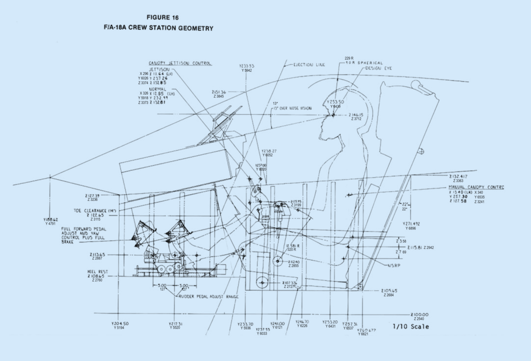
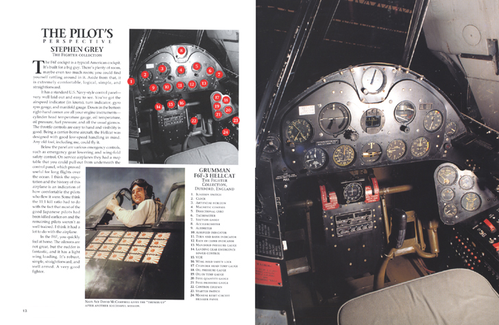
During World War II, the US air force had a huge plane crash problem. At its worst point, 17 pilots crashed in a single day. A big investigation revealed that it was not a matter of structural engineering or pilot error, but instead that the physical design of the pilot cockpit didn't fit pilots.
Even back then, there were a lot of controls in the airplane cockpit.

The prototype cockpit was designed based on some very old measurements taken from pilots in the 1920s. The size and shape of the seat, the distance to the pedals and stick, the height of the windshield, were all built to conform to the average dimensions of a 1926 pilot. So in 1950, they asked researchers to calculate the new average.

So this led to quite an intensive user research investigation and the largest study of pilots that had ever been undertaken. More than 4,000 pilots were measured - 140 dimensions of size, including thumb length, inseam height, and the distance from a pilot’s eye to his ear, were measured and then the average for each of these dimensions was calculated. But one of the researchers, Gilbert S Daniels, would later become famous for daring to ask the question: How many pilots really were average?

Applying just ten of the size dimensions,  Daniels found that none of the over 4000 pilots measured was average on all ten dimensions. When looking at just three dimensions, still less than five percent were average.

Customizability is something we take for granted.

So instead of making a cockpit of mediocrity for everyone, the team embraced designing for customizability. This had led to a lot of features that you now experience when getting into a car such as reclining your seat 5 different dimensions or adjusting your side mirrors...    

The value of qualitative data is how rich it is with details
Understanding just how different your users can be is a powerful mentality when you're designing for such a large and unsegmented user base.  So back to my team and stakeholders and their average user fixation... I tried a lot. My colleague coordinated a bunch of onsite user research interviews. We kept sharing access to our insights and direct user quotes across our teams, and even presented high level takeaways. But it didn't stick. Meetings were still centered around an "average user."

So I tried something different. I made flashy patient personas. They were a bit different in that I centered them around specific projects and removed most of the content beyond just Goals and Frustrations. But here's what mattered: They were one page, digestible, and pleasing to the eye. Before meetings, I would print them out and hang them up in the room. To my surprise, it really did create a culture shift.
They were nothing fancy. But they persisted.
Stakeholders began referring to specific users by name. Instead of "hey, the average user doesn't care about how we collect this info," conversations instead began being framed around "How would Maxine feel about this change we're proposing?" One of the most surprising things was that stakeholders each had a tendency to resonate with a particular persona, and they ended up becoming that user's biggest champion.
IDC how you do it... get your team to care about individual users
Designers can continue to scoff at personas. And most people make junk personas. But hey, YMMV. If you're going to do it, here's some of my general advice:
  • Treat your persona like a clickbait thumbnail - link your original research (And if you're not basing them off research then please don't make them!!!)
  • Make them for a specific project or workflow. If they're too general then they are of no use.  
  • Keep it simple and don't bother with templates
  • Don't try to quantify a qualitative data point!!! (ex: saying tech skills 5/10 means nothing! instead, talk about how the user struggles with technology relevant to your context) 
  • Recycle them for different use cases
I tried to imagine what kind of context this user's insights would be valuable for, and landed on some sort of project where Figma explores integrating the experiences across their various tooling apps better.
And finally, here's how I would fix that persona example from earlier. IMO, if you're doing it right, you're essentially just creating a user-centered problem statement.

But hey, it's another storytelling tool.
Thank you for reading!
Back to home ↑