Helping patients message smart, not more
Breaking silos
Data-driven design
šŸ“š 5-8 min read
2 years after the telehealth surge of the pandemic, Ā and patients were still texting providers at unsustainably high rates.
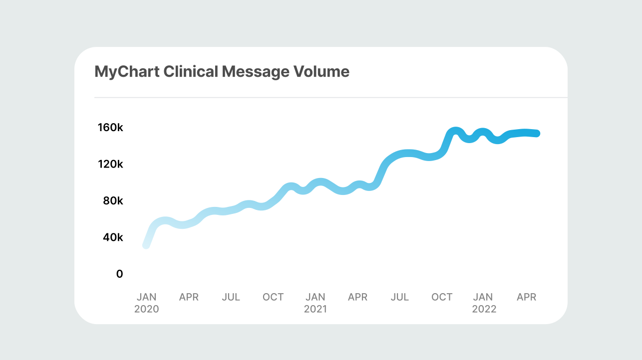
Provider burnout would be front and center issue forĀ MyChart's Patient experience team for the next few years. A permanent behavioral shift towards digital and asynchronous healthcare meant that clinicians were now receiving up to 157% of their pre-pandemic volume of patient messages. Ā 
Our team's primary goal was to make messaging more efficient and manageable for the recipients, not just the senders. Service design babyyyy.
This data was gathered internally through Epic's feature-tracking.
Problem statement
Providers are burnt out by an overhwelming volume of messages due to a shift in patient behavior towards messaging their care team as their first step in seeking care.
The Outcomes
We've saved clinical responders 175,000 clicks per week
Previously around ~10% of new message chains could've been replies instead. We've since reduced that number to ~4%. This means fewer messages go through the routing workflow.
We've saved each org millions of dollars per year
We're still crunching this final number, but we know it's millions. After all, it costs a health organiation approzimately 2.78 every time a patient sends a message.
24% of patients now choose a self-service option ​
The triage menu has redirected patient behavior from sending a message to more appropriate avenues such as the "Refill Meds" form.
Quantitative data &Ā talking to providers
We spent a lot of time feature tracking, but to understand the full story, IĀ sat down and talked to a bunch of providers among different specialties at different organizations.
šŸ’” We found that patients were sending duplicative messaging, and in some cases bypassing more appropriate or efficient channels like phone triage or appointment based on the medical situation.
Providers had been managing these innefficiencies for years, but the sheer increase in volume made these issues go from an annoying to unmanageable.
What were customer health orgs doing?Ā 
Before getting too deep into the solution space, our 400 healthcare organization customersĀ were already strategizing plans to tackle this problem at lightning speed. For example, NYUĀ Langone Health conducted their own study on how physicians interacted with volume and types of messages received, along with time spent after-hours and on weekends logging into the system. Read more
This is a sports analogy the Clinical Innovation Officer of Oschner Health presented to me.
The football analogy may have been lost on me, but the message was loud and clear:Ā patients aren't really messaging their providers anymore.They're messaging a group of receivers. Our internal messaging system definitely wasn't designed for this. There was no visibility of system status to patients that their message had been rerouted.
Understanding what we were starting with.
A few years prior, our patient messaging portal had undergone a full redesign. When MyChart's design system was restructured for a mobile-first experience, so the team had looked towards short-from modes of communication, like iMessage, for design inspiration.
šŸ’” Here's the problem:Ā Messaging your doctor isn't like texting. But our previous UIĀ had oversimplified the experience to the point where that's exactly what it felt like.
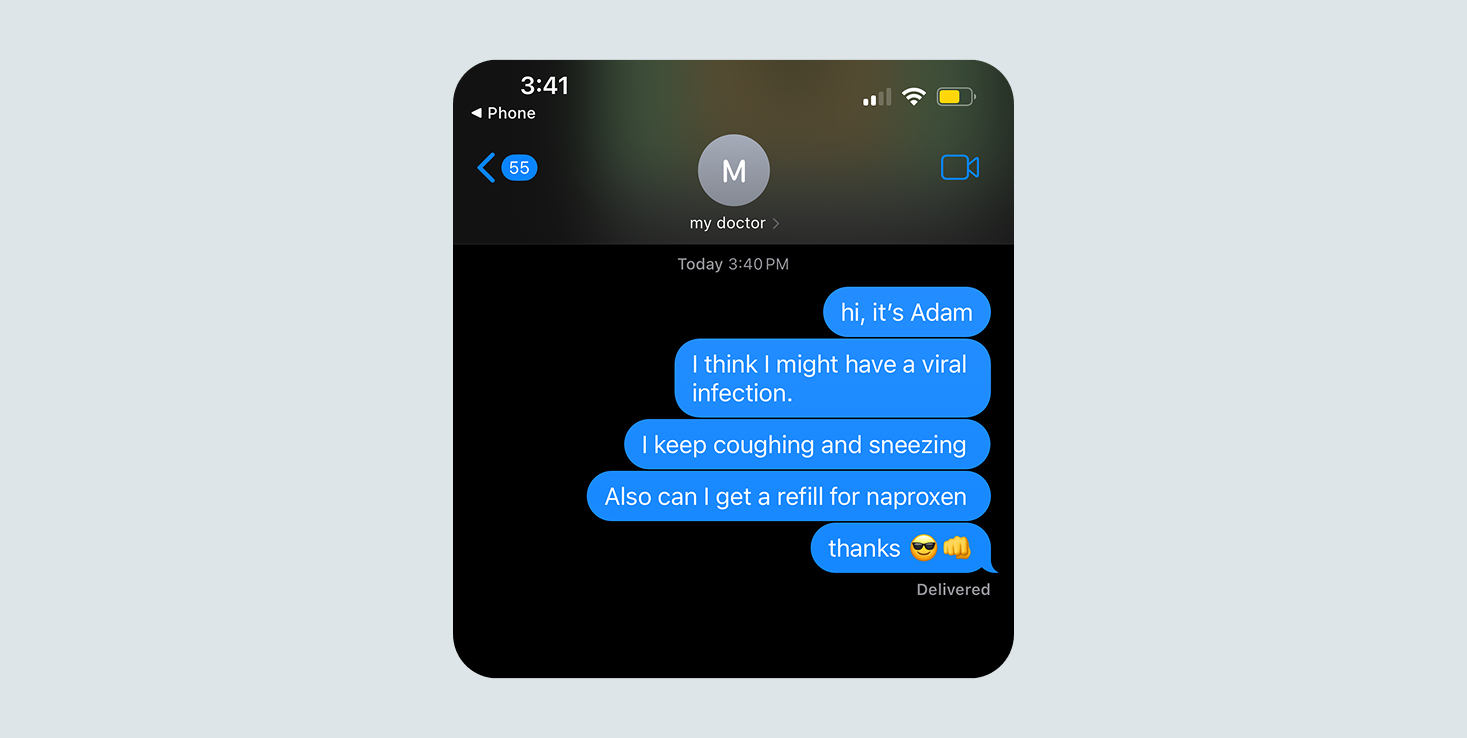
I can't show you the details on my public site, but all you need to know is that the previous UI felt like Ā iMessage and this was the behavioral impact.
I can't show you the details on my public site, but all you need to know is that the previous UI Message a this was the behavioral impact.
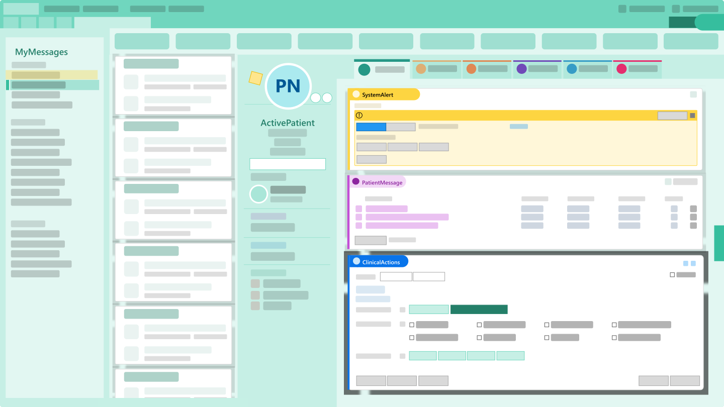
Meanwhile, this is what a provider would see (abstracted but realistic enough)
Imagine if the people you worked with emailed you like they texted. Providers were getting a clutter of inefficient messages in their inbox. IĀ led a competitive analysis brainstorm with our team to analyze mobile emailing applications and professional short-form communication methods like Slack and Teams.
We relied on our early adopter customers to understand our user and user test ideas
With little to no avenues at the company for talking a patient directly for feedbackĀ (this is loaded topic separate from a case study), I continuously had to get scrappy.
šŸ’” When there's no research budget, what do you do? IĀ worked with 3 separate customer healthcare organizations' UXĀ teams to setup various user testing strategies including surveys, interviews, and live usability testing.
This really became a two-pronged approach: understand the patients, and understand the customer org needs. Becuase often, the patients' and providers' goals were at odds.

Here are a few examples of how IĀ collaborated with our customers:
  • We coopted a survey with NYU to answer broader attitudinal questions about AIĀ intervention in messaging from patients and providers.
  • AdventHealth hosted us onsite to conduct in-person patient interviews and live usability testing of messaging UIĀ changes.
  • We met with Ochsner Health's UXĀ team to see the changes they had made to their out-of-the-box MyChart and see their patient research studies behind it.
Here are a few abstracted UI solutions I designed
We love NDAs. Sadly I can't show you the final product here. But on a high level, here are some of the bigger changes IĀ made to our messaging platform and the reasoning behind it.
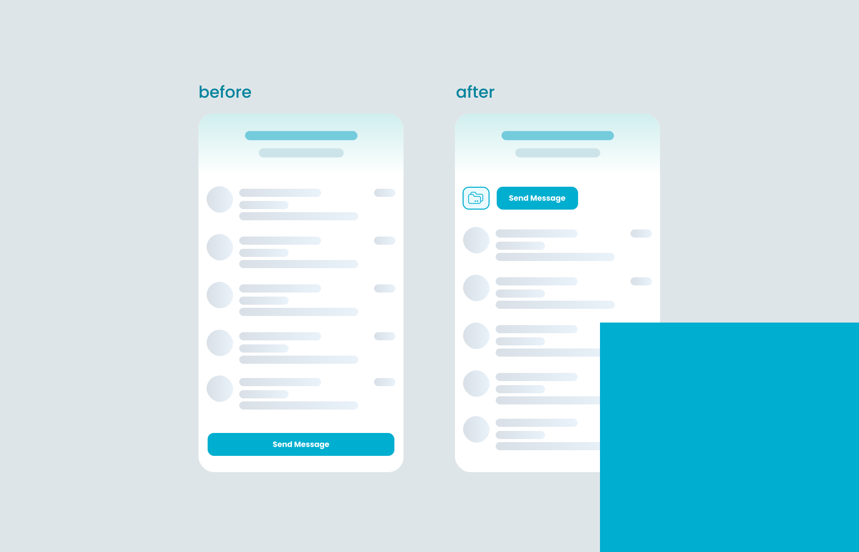
Small UIĀ tweak with one goal:Ā Place existing messages closer to reach and the new message button farther.
Small UI tweak with one goal: Place existing messages closer to reach and the new message button farther.
Display average response times for each care option to set expectations and encourage seeking faster forms of care.
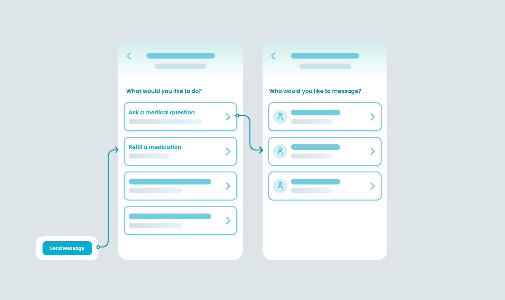
New triage menu shows patients different Ā care options.
ā€
Display average response times for each care option to set expectations and encourage seeking faster forms of care.

Problem #1: Some patients should be seeking a faster or more appropriate form of care rather than sending a message. Simply put, we were making it too easy.

Role: UXĀ researcher and designer

How IĀ solved it:Ā IĀ built a triage menu that shows patients their options for different forms of care before a message can be typed.

  • AĀ large chunk of messages are medication refill requests - patients are now directed to our dedicated workflow for that and skip messaging altogether.
Rather than trying to diagnose, it suggests the patient gets a human in the loop immediately.
Urgency model detects a potential emergency in the patient's message
Urgency model detects a potential emergency in the patient's message.

Rather than trying to diagnose, it suggests the patient gets a human in the loop immediately.

Problem #2: Patients send emergency messages after hours. After talking to providers, this is one of the most devastating experiences that many recall:Ā Coming into work on a Monday and seeing a patient message containing stroke symptoms and not knowing if they got the care they needed.

Role: UXĀ designer and AIĀ ethics advocate

How IĀ solved it:Ā IĀ worked with our cognitive computing team to translate our provider-facing urgency model into patient contexts

  • Don't want to get too much into the weeds here, but ask me more about some of the changes we made to the model and patient safety storyboarding I did!
Inbox menu and subject lines - rather than recipient names - Ā orients communication around purpose
New messaging hub interactions designed for mobile gestures such as tapping and swiping.
ā€
Inbox menu and subject lines - rather than recipient names - Ā orients communication around purpose.

Problem #3: The messaging hub was outdated - patients continously were failingĀ task based usability studies on how to find other folders in their inbox and basic interactions such as selecting or archiving messages.

Role: UX designer

How IĀ solved it:Ā IĀ worked with our cognitive computing team to translate our provider-facing urgency model into patient contexts
  • Don't want to get too much into the weeds here, but ask me more about some of the changes we made to the model and patient safety storyboarding I did!
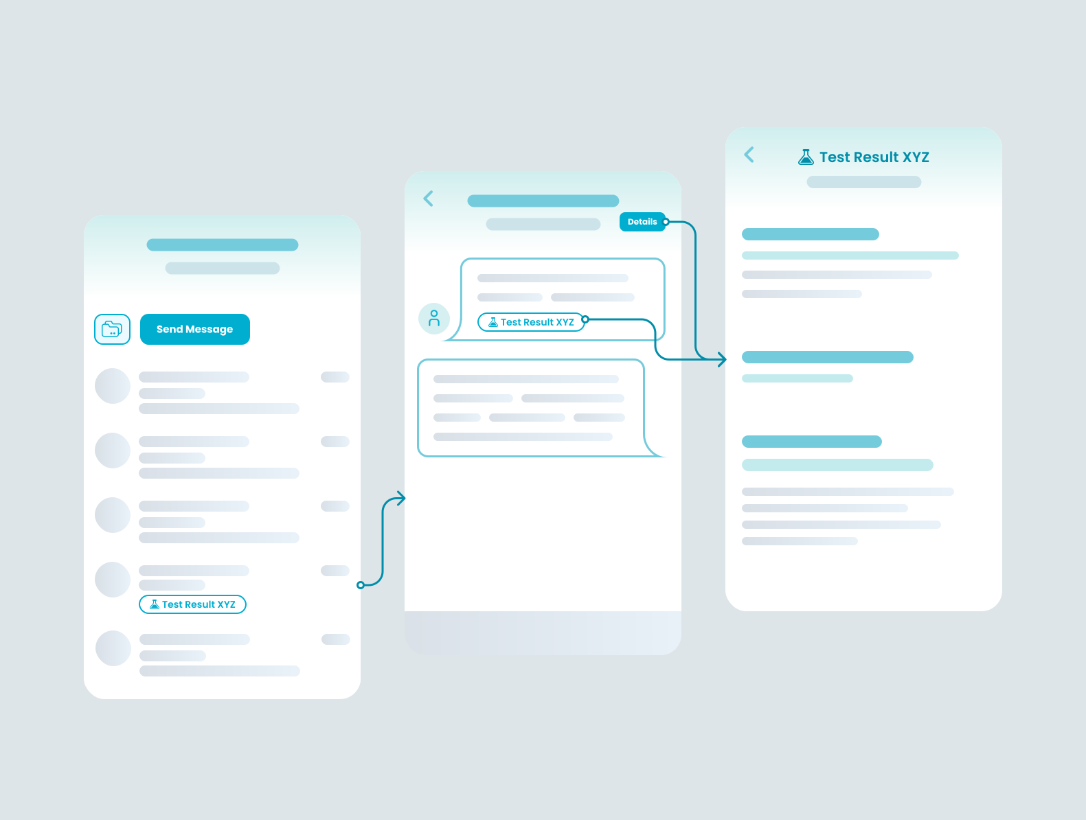
New contextual badges and details page so that patients can see the same important info as providers.
Adding a healthy level of complexity back to the patient side.
ā€
New contextual badges and details page so that patients can see the same important info as providers.

Problem #4: If a patient is being messaged about the test result, they previously were not given contextual access to that test result - despite this being supported by our system and displayed on the provider's end. This led to patients asking preventable clarifying questions.

Role: UIĀ builder, Design system stuff

How IĀ solved it:Ā This issue had been well researched, so my main task was finding a way to fit all this info into a clunked upĀ UI. I built a north star with all these incrememntally developed features beforehand to avoid the issue of realizing later we had run out of space. This also led to some rad design system updates and quality of life improvements across MyChart that our foundations team developed, freeing up my team's budget to work on backlog projects.

The team tackling things on the other side
One of our teams had been exploring another solution.Ā Clinicians told our developers that they wanted to show patients when they were out of office, and we had taken the solution at face value without understanding the core problem. Uh oh.
šŸ’” The patient and provider experience were two sides of the same coin, but our product teams were completely siloed. IĀ pushed to get all of us in the same room weekly, which saved us from disaster.
What our developers didn't know is that the siloed provider-facing team was already building a super efficient routing model that would redirect patient messages to the right person.
Patients seeing this might not realize that even though their recipient is OOO, that their message will be seen by the care team.

Problem #5: We wanted to show patients when providers were out of office.

Role: Naysayer

How IĀ solved it:Ā Get our siloed teams in a room and build a more collaborative culture so that we don't develop duplicative solutions in the future. Our engineers should know not only what the patient is seeing, but what the provider is seeing on the other end too.

Show that the feature is not a net neutral, but actually harmful through disaster storyboarding (read more about that here). The worst case scenario is that this would influence patients to message multiple providers about the same problem.

What was the dev handoff like?
When IĀ first made the pitch for such a massive UIĀ overhaul, it was a big cost for leadership to consider. IĀ strategized with our foundations &Ā design systems teams to see if any of these changes could be cross-team collaborations.

The end result was that we got a bunch of development "forĀ free."Ā We were actually able to deprecate old code and scale up new components to the other functional areas of MyChart.
Dev handoff was a lot like a bob ross painting. I had the vision all along, but worked with engingeers to make one little tree at a time :) 🌲🌲
Dev handoff was a lot like a bob ross painting. I had the vision all along, but worked with engingeers to make one little tree at a time :) 🌲🌲
Thank you for reading!
Back to home