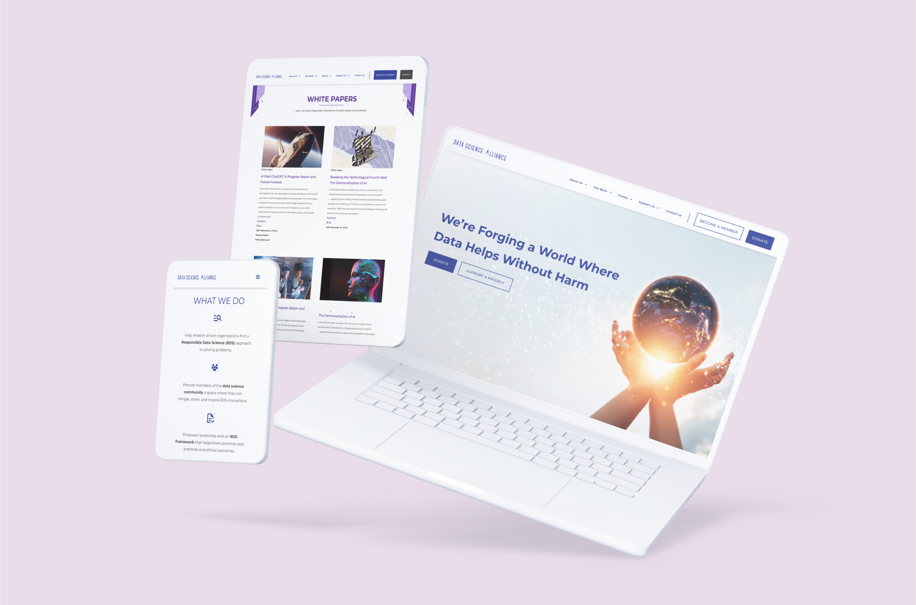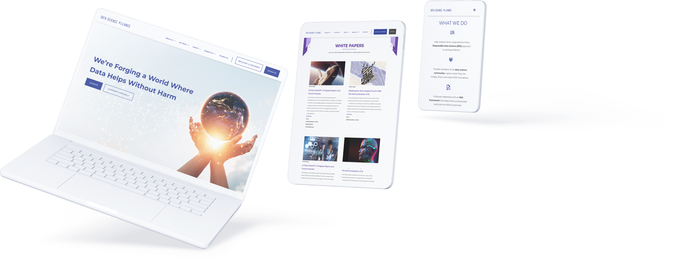

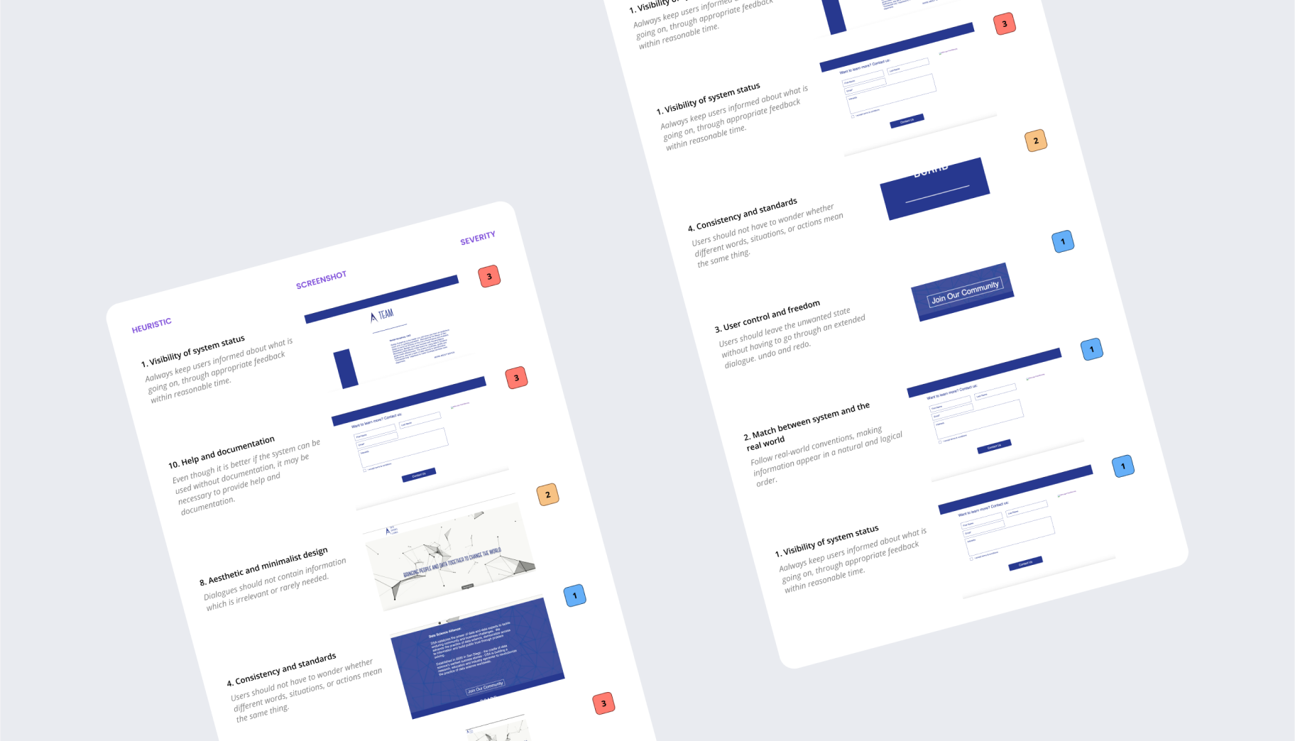
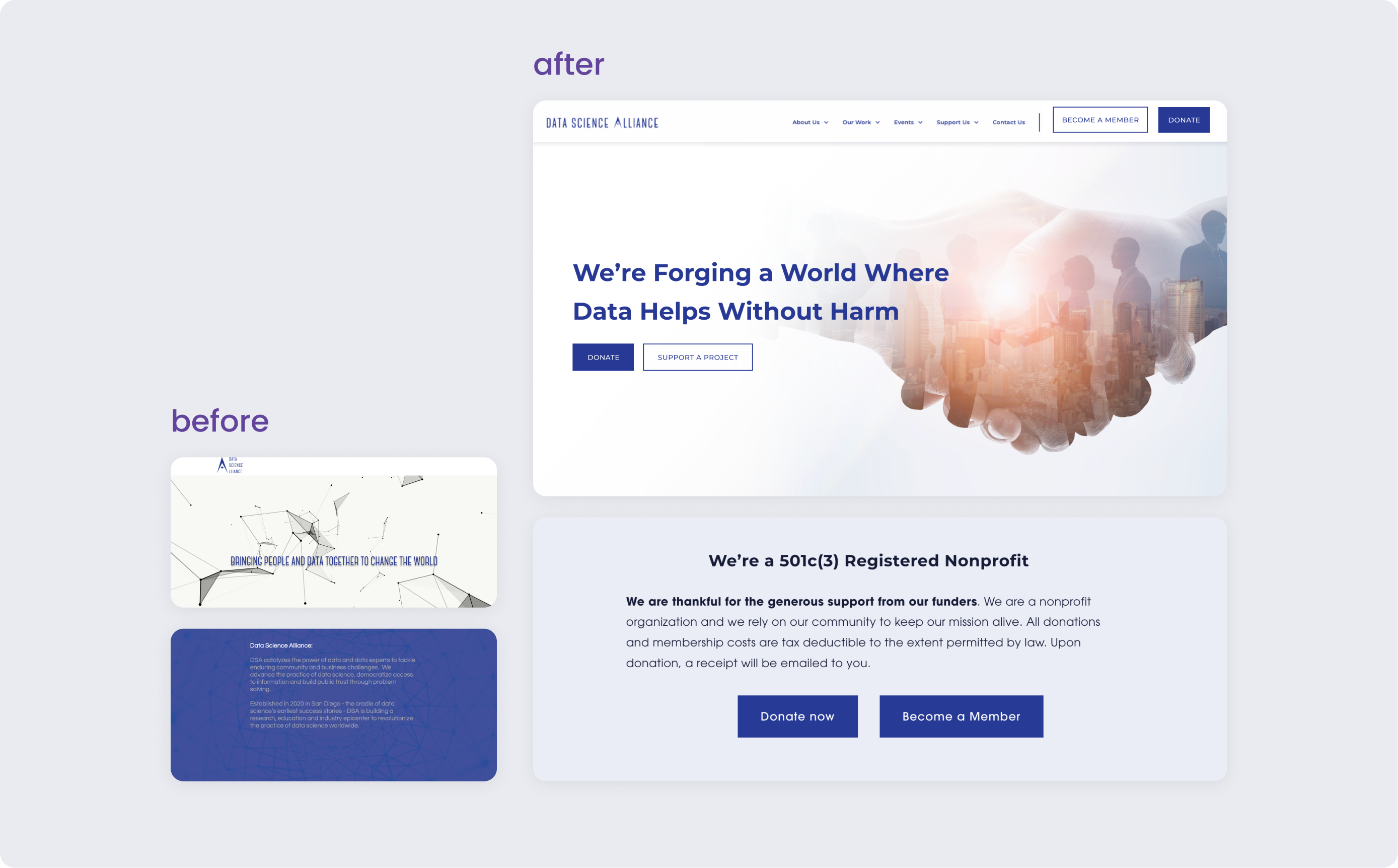
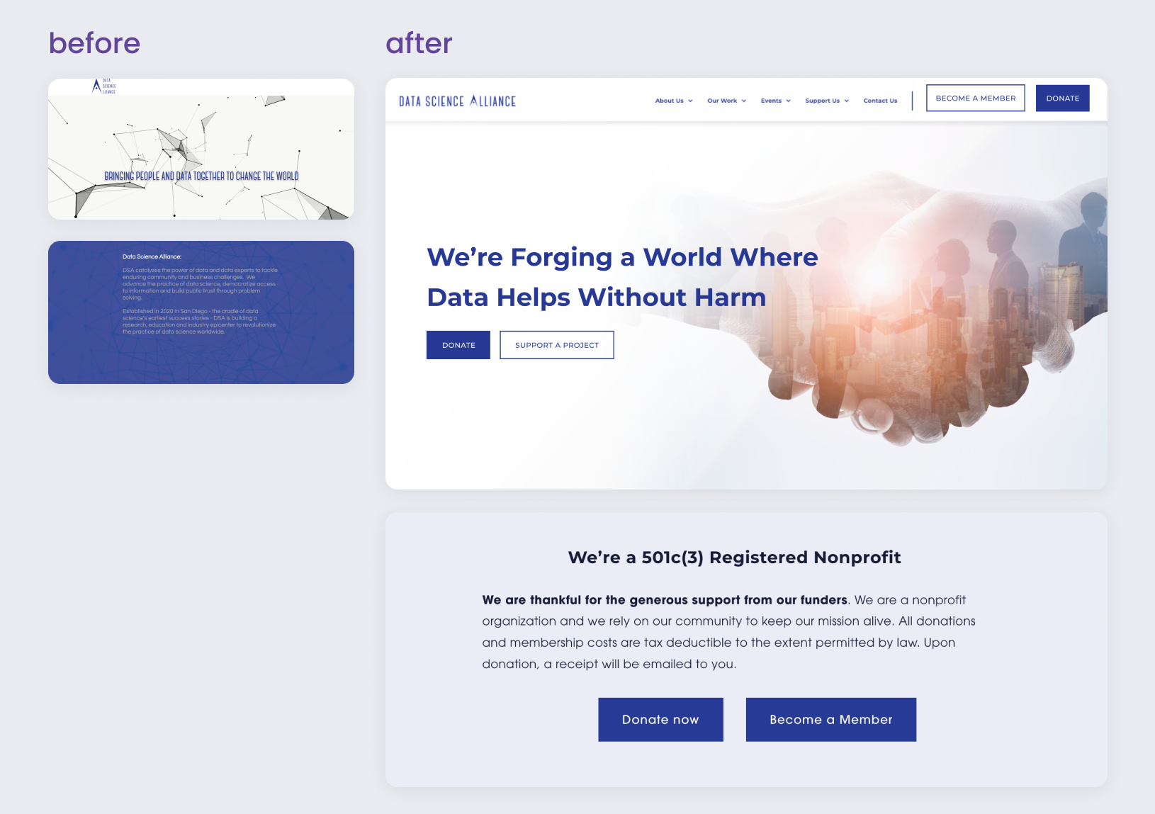
Problem #1: Previous site, especially the home page, contained a lot of heuristic violations for minimal and aesthetic design. Text was not meeting contrast against certain backgrounds, and certain clickable elements were unclear.
Role: UX designer, A11y
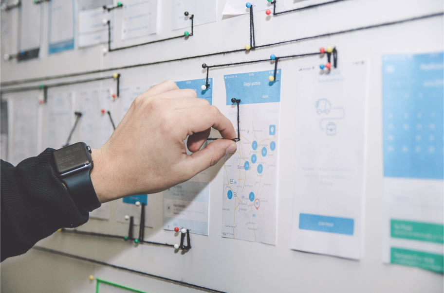
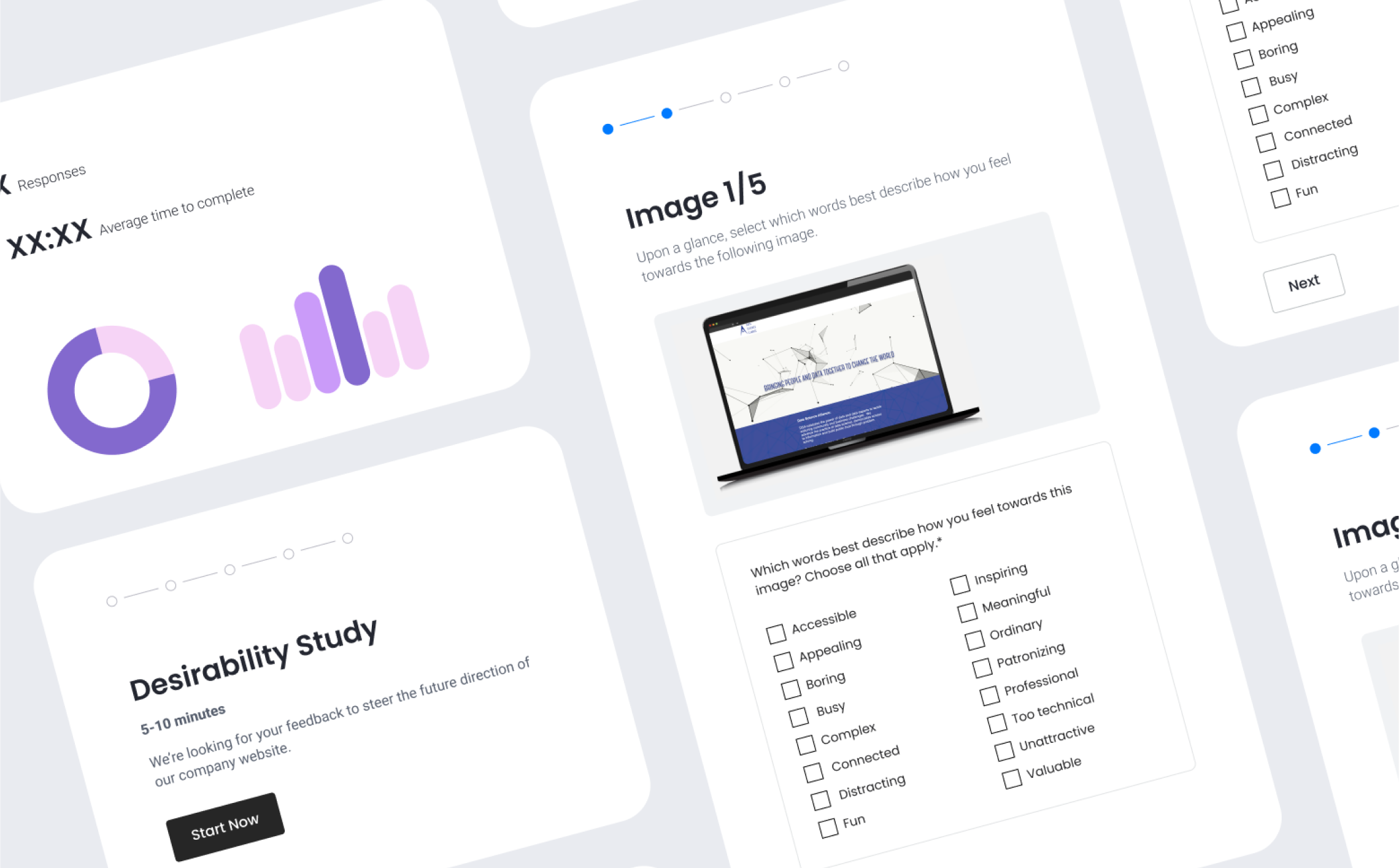
How I solved it: I did a quick site-wide eval to catch as many heuristic issues as possible to set a baseline. I met with our branding specialist to set target brand words such as “futuristic” “fun” and “professional” and came up with some variations of the home page to show users. I took the results from the desirability testing to the team and updated the design. One thing we changed after user feedback was removing an animated background as a few users found it dizzying or distracting.
Problem #1: Previous site, especially the home page, contained a lot of heuristic violations for minimal and aesthetic design. Text was not meeting contrast against certain backgrounds, and certain clickable elements were unclear.
Role: UX designer, A11y
How I solved it: Updated visuals to meet WCAG 2.0 AA contrast and higher standards for visual polish. I did a quick site-wide eval to catch as many heuristic issues as possible to set a baseline. I met with our branding specialist to set target brand words such as “futuristic” “fun” and “professional” and came up with some variations of the home page to show users. I took the results from the desirability testing to the team and updated the design. One thing we changed after user feedback was removing an animated background as a few users found it dizzying or distracting.


Problem #2: Users were confused by the wording of buttons and links on the site, and could not find critical pages, causing a loss of traffic and user conversion into the sales funnel.
Role: Content designer
How I solved it: I simplified wording used in buttons to be more clear to users what will happen when they click. I looked for ways to keep our fun and quirky voice throughout the site without it harming usability. I focused on standardizing our CTAs and the navigation bar on the principle that if a user doesn’t know what a button does, they won’t click it. Validated clarity of wording and info arch with user testing. As a result, the ratio of traffic to the events and donation pages over the home page massively improved after launch.
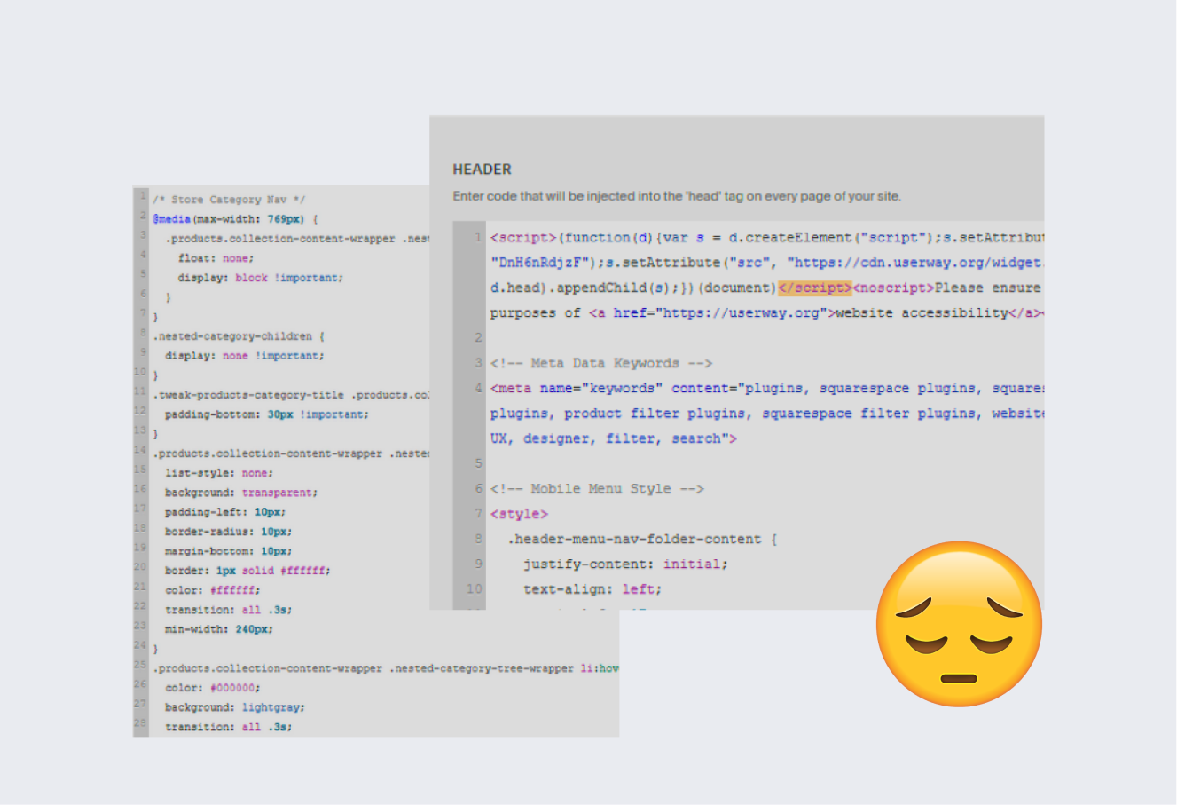
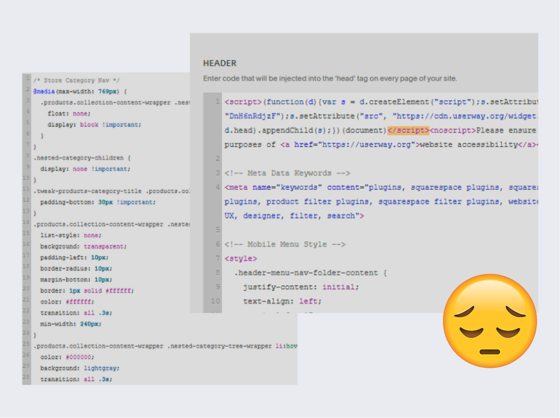
Problem #3: Previous site was difficult to maintain without coding expertise, causing an information delay between social media and the website.
Role: Webmaster
How I solved it: I worked to find a balance between getting as close to the mockups as possible with using Squarespace’s template engine as much as possible to ensure that anyone else could go into the site editor and quickly make content updates. I worked with our PM to determine which features were worth custom editing by exploring alternative workarounds and assessing how often a feature would be edited. For example, we chose not to custom code our original carousel design for the company’s team and working group section. As a result it was easy to jump in and edit the page as members joined and left the working group.

Design system + brand kit
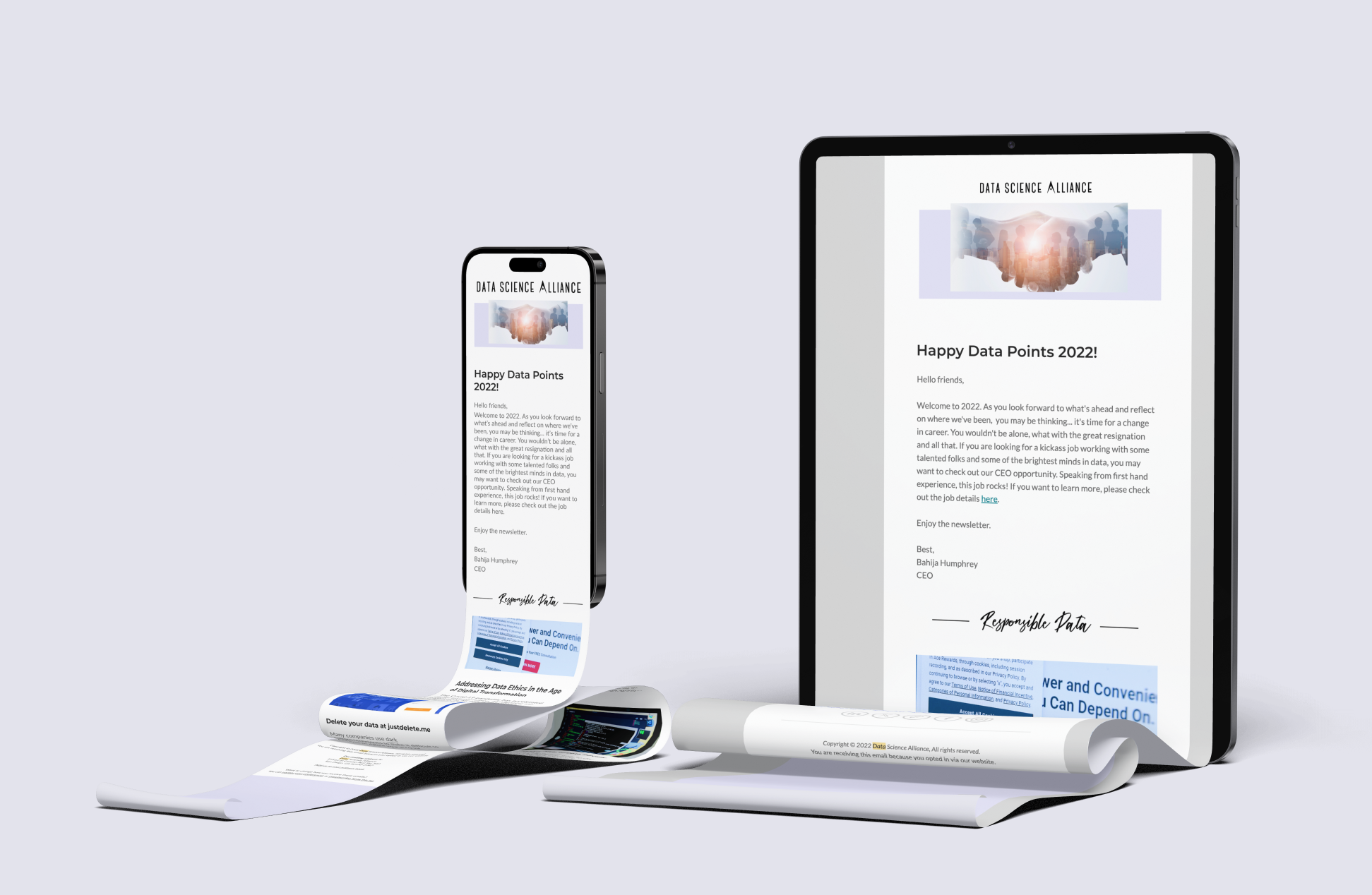
Email campaign & CMS templates still used today