Musings of a UI Challenge
Personal project
Visual design
📚 5-7 min read
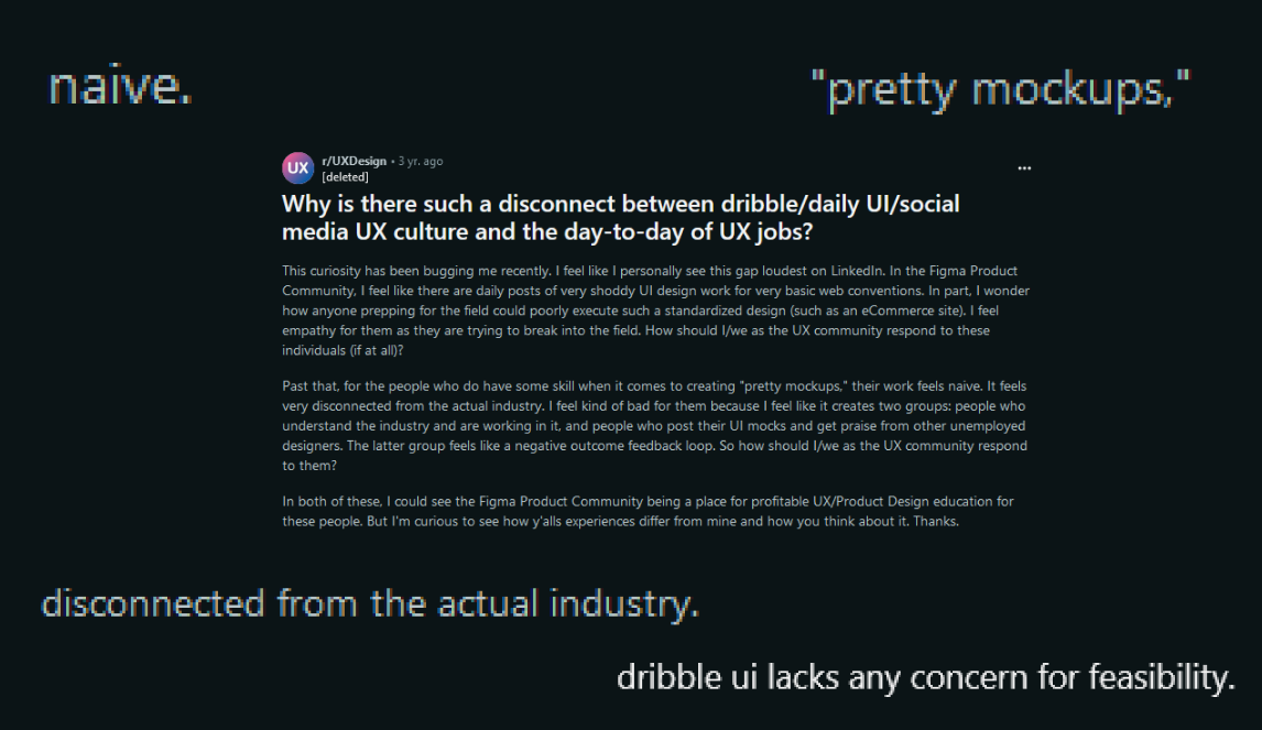
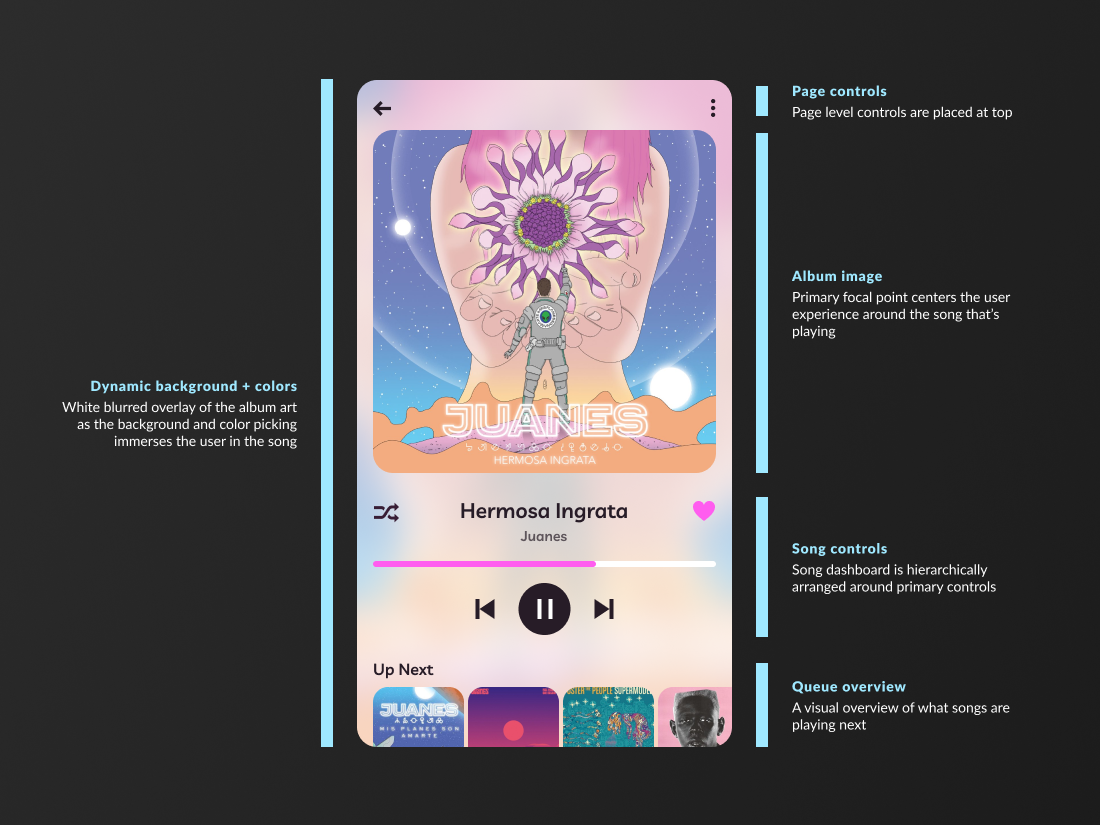
Before we get into the challenge, I want to talk about the elephant in the room. There’s a lot of buzz in the design community about the controversy of doing UI dribble. There are tons of LinkedIn posts talking about how designing visuals without solving real problems or working with stakeholders isn’t real design. I understand where they’re coming from - designing a product for a business isn’t as cut and dry, and boot camps and academic curriculum can’t replace real experience.

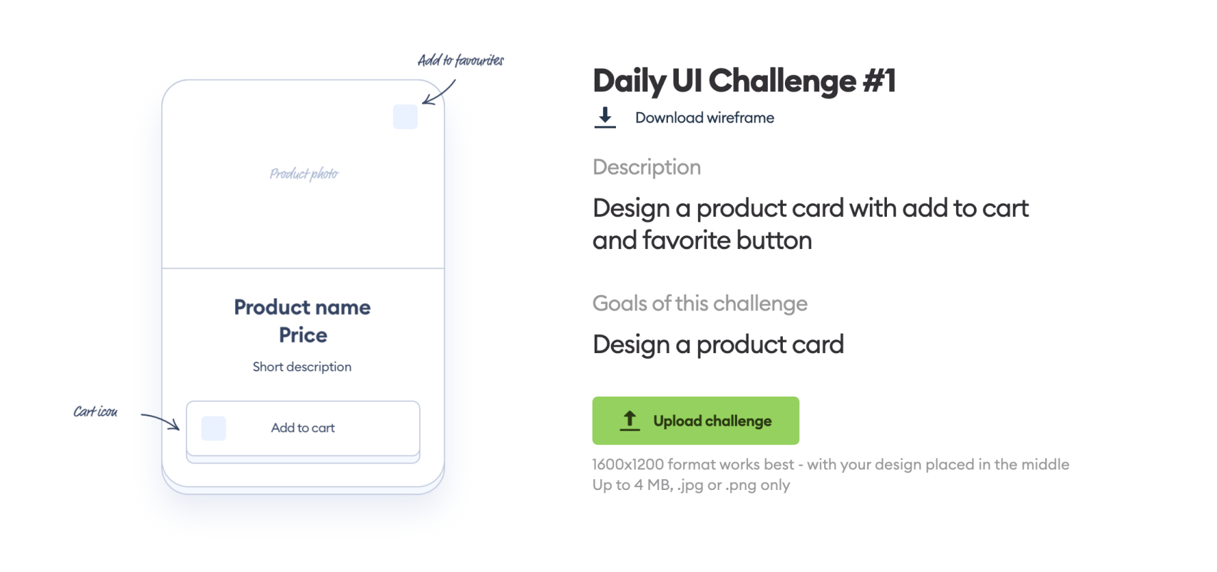
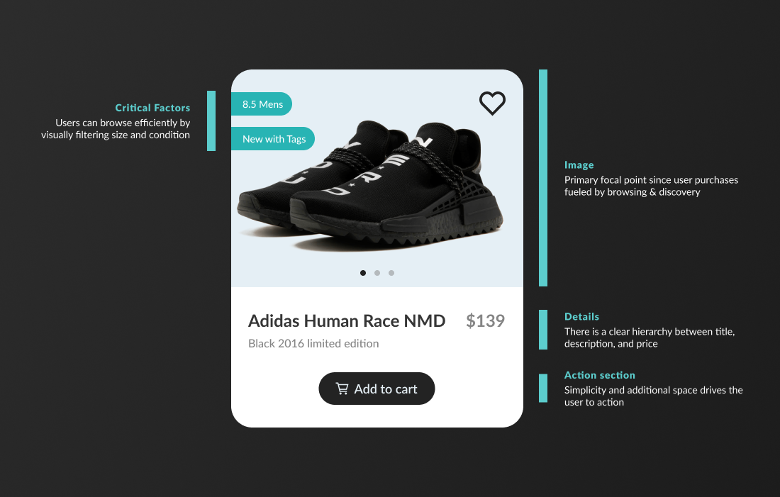
But here's why I did this challenge. In 2023, I had moved to a more strategic big picture role at my company where I mostly worked within the constraints of existing design systems. Visual design was a skill that I wanted to work on levelling up.  I wanted to explore different visual patterns and give myself a chance to create without constraints.  So I enrolled in a daily UI challenge hosted by hype4.academy and committed to 30 days.
I disagree with this discourse... especially in 2024 where it has become increasingly difficult for entry level and student designers to find opportunities. On top of that, many design contracts include NDAs that make it difficult to showcase high fidelity work.  While visual design challenges are NOT a substitute for project experience, no one should be knocked for trying to put something out there. I think there’s value in practicing visual design and sharing my work for feedback to a larger design community.
I got a lot faster
In “Lean UX” by Jeff Gothelf, he shares a story of a pottery professor who offered his students a two choices every semester:
  • Make 50 pots fast within the first 4 weeks of the semester and receive an automatic A (regardless of the quality of the pots)
  • Or submit one pot that they spent as much time on as they wanted and have it graded on its quality (with no guaranteed grades)
The professor awarded the highest grade to the best pot created that semester, sparking the question of whether the top grades were earned by those who made numerous pots or by those who focused on crafting just one. Surprisingly, the students who made 50 pots consistently produced the best one, as the repeated act of creation allowed them to refine their skills and learn from their mistakes. This emphasizes that practice and embracing imperfection are key to improvement, rather than striving for perfection in a single attempt.

This felt a lot like that. While some days of this challenge felt challenging and exciting, many times  the assignments felt straightforward and uninspiring. Looking back, however, I realized it was the most monotonous and lackluster challenges - the ones that didn’t even make the this highlights blog - that increased my prototyping skills the most. Halfway through the challenge I had rhythm and was finishing most daily assignments in under 30 minutes with consistent quality.
This was the first challenge I did, and also the one that took me the longest despite its lack of complexity.
Giving myself permission to fail
This was my favorite challenge: to create a music player screen. My goal was to come up with a design that highlighted the album art, and took inspiration from a new iOS lock screen feature that did something similar.

But it didn’t work. The biggest challenge with album art is there is no limits to variety of images and composition, which makes overlaying UI components difficult. At bare minimum, my personal parameters are always to meet WCAG 2.0 AA guidelines, which includes color contrast.

In the three examples shown, I manually selected the perfect opacity for each overlay  based on the album art. While this could technically be applied programmatically by developing system logic to detect brightness values and apply different percentage capacities, it’s not an easy or ideal  solution. I know I wouldn’t be satisfied with this proposal if I had to pitch it to a room with real stakeholders. If there was more time, I could’ve explored other options or found a way to make this idea work.

At some point I needed to call it a day with this challenge and accept this was a fictional scenario where I was allowed to take risks and explore concepts without the burden of feasibility.
This would’ve been such a cool concept! But really this would fall apart for accessibility and contrast if real album images were shown outside of the ones I curated.
Connecting with art
Around the time of this challenge, I was working on enterprise products that had to account for a lot of unknowns and customization. Most decorative assets, icons, images, and colors I worked with were used primarily as placeholders with the understanding that our B2B customers would rebrand our products. It was so refreshing to get creative control back with these challenges. Putting TLC into curating assets and drawing inspiration from art has been such an important, and fun, part of this challenge.

There’s talk in the design community that the work we do isn’t necessarily art. It seems this is partly in response to an increasing industry culture where designers feel reduced to their visual skills. In defense of our craft, it’s true that there’s more to our work than just visuals. There is so much research, science, and communication skills that go into the design process.

Lately, art as a necessity in design is something I’ve learned to embrace - the aesthetic usability effect is real, and I think visual design is a critical skill in my craft.  This challenge has been nostalgic or my freelance web design days where the hero image I selected was just as important as the layout and information architecture of my design.
First was a challenge to create a popup for a news app. Second was a challenge to design a credit card for a digital wallet.
Honing my personal style
Trends are trends. In college, which had been around the fall of 2019, I read Steve Krug’s “Dont Make me Think.” - particularly, his first edition which came out in the year 2000. It’s incredible how majority of his insights and predictions hold up two decades later. But I was most fascinated by the 10% of his predictions that seemed to be proven wrong.

I read his chapter about how flat design was just a fad. I mentally put that in the bucket of things he got wrong. Six years later, and now flat design seems to be on its way out again. The message that I took is that there’s a balance between keeping up with trends and sometimes cutting out all the noise and discovering your own style.

Currently, I enjoy designing glassmorphic effects, pastel colors and calming gradients. This comes out in my hobby paintings too, where I’ve been exploring impressionism and candy colored hues. Right now, it’s what brings me joy.
First was a challenge to create a virtual calendar, with my added twist of using the MacOS design system. Second was a challenge to create a login screen for a party finder app.
Thank you for reading!
Back to home ↑